OVERVIEW
Project Description:
During my first semester at Berkeley, I wanted to find the best places to study. I went to campus, but wasn’t sure which space fit my needs. Furthermore, even if I did find a space, it was usually full!
In my Human-Centered Design Class, while we were discussing pain points of our day, I found that my study space frustrations were not unique to me.
Thus, Bear Spaces was born!
Role: Lead Designer
Timeline: Nov-Dec 2022
Timeline: Nov-Dec 2022

Problem:
Students do not have a way to easily find their ideal study spot on campus.
Solution:
To help students find a place to study on campus, I needed to design a solution that focused on informing students of what spaces were available and matched their desired criteria.
How might we optimize and illuminate the process of finding study spaces on campus?
PROCESS
User Research:
The first step in redesinging this experience was understanding the needs and frustrations of Cal students in regards to study spaces on campus.
To gain insight on students’ current experiences, my team and I interviewed a diverse set of 10 Berkeley students and designed questions that would have our interviewees walk through the process of finding a study space on campus.
We wanted to know
1.) How are students approaching the problem?
2.) How are students affected by the problem?
Therefore, I had to design a solution that would communicate to users that they would have a chance to assign seats in a later step and that they would not be charged right after confirming their payment details.
Synthesizing:
Based on our research, we highlighted 3 main insights:
1.) Availability of study spaces make or break studying experiences.
2.) Students want to know the availability of study spaces ahead of time.
3.) Students want a way to gain more holistic information of study spaces.
To exemplify what we gathered, my team and I created 2 personas.


From information kiosks to AI chatbots, I came up with as many possible solutions as I could.
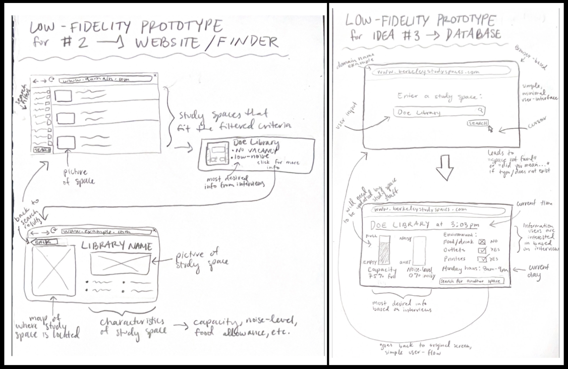
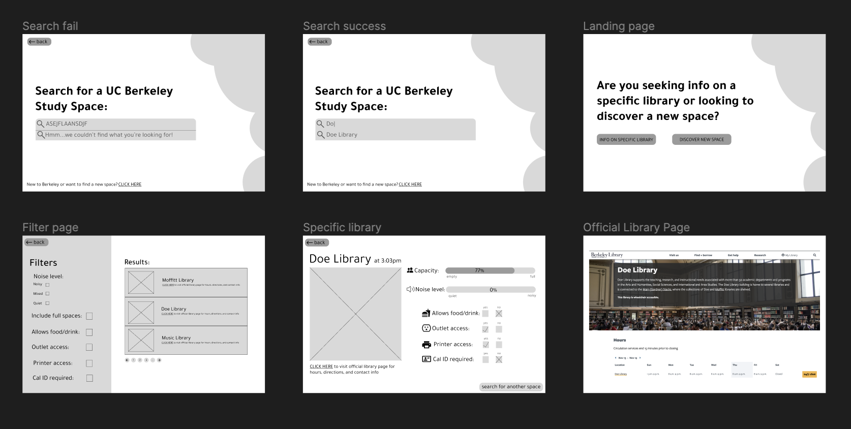
Using our preliminary research as a guide, our team decided to go with a digital approach. Our goal was to design a digital study space finder through which students could apply filters to find their ideal space.

︎︎︎Low-Fidelity Mockups︎︎︎

Usability Testing and Feedback:
Once I had a working prototype, I conducted usablilty testing with a diverse group of students. I also asked them to provide any additional feedback.
Main insights:
1.) Desire to bookmark spaces to easily check access of their go-to spots
2.) Preference for mobile version
Mockups (again!):


Using our preliminary research as a guide, our team decided to go with a digital approach. Our goal was to design a digital study space finder through which students could apply filters to find their ideal space.

︎︎︎Low-Fidelity Mockups︎︎︎

︎︎︎Mid-Fidelity Mockups︎︎︎


︎︎︎Hi-Fidelity Mockups︎︎︎
Usability Testing and Feedback:
Once I had a working prototype, I conducted usablilty testing with a diverse group of students. I also asked them to provide any additional feedback.
Main insights:
1.) Desire to bookmark spaces to easily check access of their go-to spots
2.) Preference for mobile version
Mockups (again!):

︎︎︎Lo-Fidelity Mockups︎︎︎

︎︎︎Inspiration from other apps, both from Cal and other spaces︎︎︎

︎︎︎Component building︎︎︎
FINAL PRODUCT


REFLECTION
User Needs First:
Prior to this project, I had mostly designed for web and desktop products. However, thanks to insights from user testing and feedback, I shifted my focus to a mobile design. Sometimes what you are most comfortable with is not the best way to address user needs!
