Disney Experiences
Disney Parks Blog
Product Gallery Component

Overview
Many of the posts on DisneyParksBlog showcase Disney merchandise and products. In the hopes of offering our visitors an improved purchasing experience, I designed an interactive component that allows our publishers to easily and beautifully showcase the products to drive visitors to the online Disney Store.
Many of the posts on DisneyParksBlog showcase Disney merchandise and products. In the hopes of offering our visitors an improved purchasing experience, I designed an interactive component that allows our publishers to easily and beautifully showcase the products to drive visitors to the online Disney Store.
Context
DisneyParksBlog holds all the latest Disney Experiences content, from foodie guides to highlighted social content. To keep up with the fast-paced publishing flow, our team created Aloha, a design system of pre-designed yet customizable blocks built into the WordPress Gutenberg page builder. Aloha empowers our non-technical partners to quickly and effectively update the blog while reflecting the high-quality Disney design language and standards.
DisneyParksBlog holds all the latest Disney Experiences content, from foodie guides to highlighted social content. To keep up with the fast-paced publishing flow, our team created Aloha, a design system of pre-designed yet customizable blocks built into the WordPress Gutenberg page builder. Aloha empowers our non-technical partners to quickly and effectively update the blog while reflecting the high-quality Disney design language and standards.
Process
Defining
First, I needed to define the main elements of the project.
First, I needed to define the main elements of the project.
Original Approach – What are we currently doing?
At first, content editors were uploading static images of the products and relying solely on hyperlinks in their writing to drive visitors to the online Disney Store.
At first, content editors were uploading static images of the products and relying solely on hyperlinks in their writing to drive visitors to the online Disney Store.

Pain Points – What's wrong?
Friction:
Many users skim the blogs, relying on first-impression photos to make a purchasing decision.
Having users go through the written content to find the product they're interested in slows down their experience.
Furthermore, at times it is unclear which link goes with which product image.
Lack of interactivity:
Blogs were feeling too static, lacking engaging ways for users to interact with our content.
Burden on publishers:
Publishers were limited in options to present products on the blog.
If publishers wanted to a row of of images, they had to make a collage outside of the editor and upload it as a singular asset.
Purchasing friction:
Many users skim the blogs, relying on first-impression photos to make a purchasing decision.
Having users go through the written content to find the product they're interested in slows down their experience.
Furthermore, at times it is unclear which link goes with which product image.
Lack of interactivity:
Blogs were feeling too static, lacking engaging ways for users to interact with our content.
Burden on publishers:
Publishers were limited in options to present products on the blog.
If publishers wanted to a row of of images, they had to make a collage outside of the editor and upload it as a singular asset.
Discovery
Time to get inspired!
Time to get inspired!
Research – What are other platforms doing?
Some common themes I found:
Lifestyle / posed photos surrounded by clickable product images
Hover effects
Social media-esque "tagging" of products in lifestyle photos
Some common themes I found:
Lifestyle / posed photos surrounded by clickable product images
Hover effects
Social media-esque "tagging" of products in lifestyle photos
Consistency – What's the design language of DisneyParksBlog?
If we were introducing a new interaction to blogs, I wanted to make sure that it was consistent with other interactions on our platform to make the learning curve less steep for our visitors.
We communicate that other components on DisneyParksBlog are interactive with:
Rounded borders
Black and white overlays
Drop shadows
Design
To the drawing board…aka my journal + Figma.
I explored multiple routes, but it came down to two approaches.
To the drawing board…aka my journal + Figma.
I explored multiple routes, but it came down to two approaches.
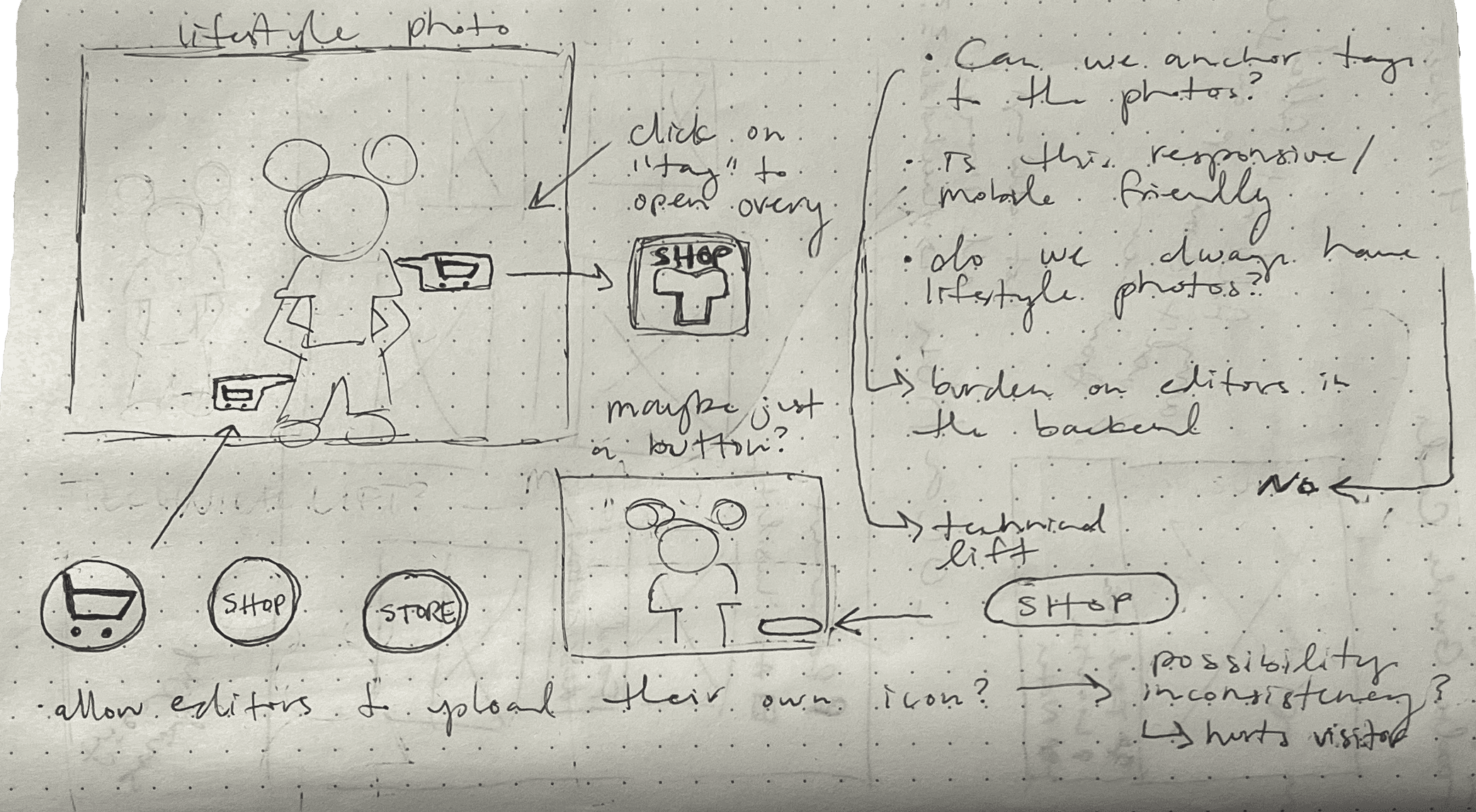
Approach #1: "Tagging" Photos
At first, I explored the idea of "tagging" each product in lifestyle photos. Each photo would have a button or interactive element that would direct them to the online Disney store.
Some initial concerns:
Responsiveness – is this approach mobile friendly?
With the way that our assets are sized and scale, multiple product tags on top of the lifestyle photos may overwhelm the user when visiting from a mobile device.
Furthermore, if we are trying to fit multiple product tags in one lifestyle photo while also making sure the buttons / tags are large enough for accessibility standards, they may cover up the lifestyle photo.
Burden on editors – are editors comfortable tagging each photo manually?
While we care about the front-end experience of our site, we are also responsible for the back-end editing experience of our publishers.
The process of using this block will be a new interaction for our publishers to learn. Relying on content editors to tag each of the photos with multiple products may slow down their publishing workflows.
Inconsistency of assets – do we always have lifestyle photos?
The nail in the coffin – we don't always have lifestyle photos available!
While we may have more traditional product images, giving those more sterile images social media tags may not fit the visual language.
Approach #2: Product "Gallery"
The approach that seemed most intuitive from the get-go was a product gallery, in which our publishers can simply upload a photo and add a link to make an interactive card that displays a call-to-action on hover.
Some reasons I liked this approach:
Responsiveness:
Whether or not the user views the blog post on a desktop or a mobile device, the cards will stack according to screen size.
Alignment with design language of DisneyParksBlog:
As I noted in my discovery phase, all interactive elements on DisneyParksBlog have the consistent details that communicate to our user that they are interactive (rounded corners, black and white overlay and drop shadow on hover, etc.)
Intuitive for editors:
Creating the cards that make up the gallery is almost identical to the process they were using before. They simply upload the photo, insert the link, and type the CTA that will appear on hover.
Support of the types of assets used:
During my discovery phase, I documented that all product images have a 1:1 ratio and all lifestyle images have a 16:9 or 9:16 ratio.
As I designed the layout of the Product Gallery, there was a clear way to support the documented assets, whether or not a lifestyle photo available.

I continued with this approach.
I continued with this approach.

After running it by other members on my team as well as our content editors, I had approval to keep moving forward!
After running it by other members on my team as well as our content editors, I had approval to keep moving forward!
After running it by members on my team as well as our content editors, I had approval to keep moving forward!

I built each individual card as a component, to act as the building blocks of the various layouts of the entire block.
I built each individual card as a component, to act as the building blocks of the various layouts of the entire block.
Result
What did this lead to?
What did this lead to?

User Satisfaction
We've been supporting our publishers in using the new Product Gallery! After its first use, it has become a highly requested tool for our publishers to easily showcase the products in a visually interesting way!
See the Product Gallery in action:
We've been supporting our publishers in using the new Product Gallery! After its first use, it has become a highly requested tool for our publishers to easily showcase the products in a visually interesting way!
See the Product Gallery in action:
We've been supporting our publishers in using the new Product Gallery! After its first use, it has become a highly requested tool for our publishers to easily showcase the products in a visually interesting way!
See the Product Gallery in action:
Future Explorations – Performance
We found that the blogs that use the Product Gallery are some of our highest performing blogs.
We are still working out our process of how we measure success of this component, but here’s how I would track it:
Add in both hyperlinks and the Product Gallery in the same blog. Track individually how many people are going to the store with the hyperlink vs. the component.
This may help isolate whether or not these blogs are performing well because other factors, such as the content of the blog or other marketing efforts.